Mastering Data Visualization: A Comprehensive Guide to Working with Charts in PowerPoint 2010
Introduction:
Charts are powerful tools for visualizing data and conveying complex information in a clear and compelling manner. In PowerPoint 2010, presenters can leverage a variety of chart types and customization options to create impactful visuals that enhance the effectiveness of their presentations. In this comprehensive guide, we will explore the intricacies of working with charts in PowerPoint 2010, covering everything from creating and formatting charts to adding interactivity and optimizing visual appeal. By mastering the art of chart design, presenters can effectively communicate data-driven insights and captivate audiences with engaging and informative presentations.
Understanding the Basics of Charts:
Charts in PowerPoint 2010 are graphical representations of data that allow presenters to illustrate trends, patterns, and relationships in a visually appealing format. From simple bar and pie charts to more complex line and scatter plots, PowerPoint 2010 offers a wide range of chart types to suit various data visualization needs. Charts consist of elements such as axes, data series, legends, and titles, which can be customized to convey information effectively and enhance visual clarity.
Creating Charts:
To create a chart in PowerPoint 2010, follow these steps:
- Select the slide where you want to insert the chart.
- Click on the “Insert” tab on the ribbon.
- Click on the “Chart” button in the Illustrations group.
- Choose the desired chart type from the Chart Types dialog box (e.g., Column, Line, Pie).
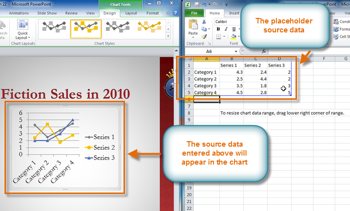
- Select the data range in the Excel-like data grid that appears, or manually enter data values for the chart.
- Click “OK” to insert the chart onto the slide.
PowerPoint 2010 also offers the option to insert charts from existing Excel files or other sources, allowing presenters to seamlessly integrate external data into their presentations.
Formatting Charts:
PowerPoint 2010 provides a wide range of formatting options for customizing the appearance of charts to match the presentation’s design and style. Some of the key formatting options include:
- Chart Styles and Layouts: PowerPoint 2010 offers built-in chart styles and layouts that users can apply to charts with a single click, providing a quick and easy way to enhance visual appeal and consistency.
- Chart Elements: Users can customize various elements of the chart, such as axes, data labels, legends, and titles, by selecting them and using the formatting options available in the Chart Tools Design and Format tabs on the ribbon.
- Colors and Patterns: Users can change the color scheme, fill patterns, and border styles of chart elements to create visually appealing and cohesive designs that align with the presentation’s theme.
- Data Series and Axis Scaling: Users can adjust the formatting of data series and axis scaling to emphasize specific data points or trends, improving the readability and interpretation of the chart.
Customizing Chart Styles:
In addition to built-in chart styles and layouts, users can create custom chart styles in PowerPoint 2010 to match the presentation’s branding or design requirements. To create a custom chart style, follow these steps:
- Select the chart or a portion of the chart that you want to customize.
- Click on the “Design” tab on the ribbon.
- Click on the “More” button in the Chart Styles group to open the Chart Styles gallery.
- Scroll down to the bottom of the gallery and select the “Save as Template” option.
- In the Save Chart Template dialog box, specify a name for the custom chart style and click “Save” to create the template.
Once created, the custom chart style will be available for use in the Chart Styles gallery, allowing users to apply it to charts throughout the presentation.
Adding Interactivity:
To enhance the interactivity and engagement of charts in PowerPoint 2010, consider the following tips and techniques:
- Animating Charts: Use PowerPoint’s animation features to animate the elements of a chart, such as data series or labels, to reveal information gradually and capture audience attention.
- Adding Hyperlinks: Insert hyperlinks into chart elements to allow users to navigate to other slides or external sources for more detailed information or analysis.
- Interactive Controls: Utilize interactive controls, such as checkboxes or sliders, to enable users to manipulate chart data dynamically and explore different scenarios or outcomes.
- Embedding Multimedia: Enhance charts with multimedia elements, such as audio or video clips, to provide additional context or explanation for the data presented.
Conclusion:
Charts are indispensable tools for visualizing data and conveying complex information in a clear and compelling manner. By mastering the art of chart design in PowerPoint 2010, presenters can create impactful visuals that enhance the effectiveness of their presentations and captivate audiences with engaging and informative content. Whether showcasing trends, comparing data, or highlighting key insights, charts provide a versatile and powerful means of communicating data-driven narratives that resonate with audiences long after the presentation ends. With careful attention to design principles, formatting options, and interactivity features, presenters can harness the full potential of charts in PowerPoint 2010 to create memorable and persuasive presentations that leave a lasting impression on audiences.