Harmony in Design: The Intrinsic Role of Layout and Composition in Graphic Design

Introduction:
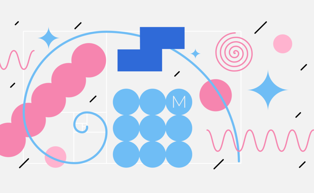
In the multifaceted realm of graphic design, layout and composition emerge as foundational elements that wield the power to transform visual chaos into compelling narratives. This extensive article embarks on a comprehensive exploration of the intrinsic significance of layout and composition, delving into historical evolution, principles, practical applications, and the symbiotic relationship between form and function in graphic design.
Section 1: The Evolution of Layout and Composition
1.1 Origins in Print Design
The origins of layout and composition can be traced back to the dawn of print design. From the meticulous arrangement of movable type in early printing presses to the ornate layouts of illuminated manuscripts, designers grappled with organizing visual elements to convey information and captivate audiences. The evolution of print technologies further fueled the development of layout principles.
1.2 Modernism and the Grid System
The 20th century witnessed a paradigm shift with the advent of modernism. Pioneered by designers like Jan Tschichold and Josef Müller-Brockmann, the grid system became a defining feature of layout design. The grid brought order, structure, and clarity to compositions, influencing a generation of designers and setting the stage for a new era of graphic design.
Section 2: Principles of Layout and Composition
2.1 Hierarchy and Visual Flow
Hierarchy establishes a visual order that guides the viewer’s eye through a design. Headlines, subheadings, and body text are strategically arranged to create a hierarchy of information. Visual flow ensures a seamless journey for the viewer, leading them from one element to the next in a logical progression.
2.2 Balance and Symmetry
Balance is a key principle that promotes visual equilibrium in a design. Achieving balance involves distributing visual weight evenly, whether through symmetrical or asymmetrical arrangements. Symmetry imparts a sense of formality, while asymmetry introduces dynamism and visual interest.
2.3 Proximity and Alignment
The proximity of elements within a layout communicates their relationship to one another. Elements grouped closely together convey a connection, while ample space denotes separation. Alignment ensures a cohesive visual structure, guiding the viewer’s interpretation of the design’s organization.
Section 3: The Role of Composition in Visual Storytelling
3.1 Narrative Flow and Sequencing
Effective composition serves as a storyteller, guiding the viewer through a visual narrative. Sequential arrangements of images, text, and other elements create a sense of progression. Whether in editorial design, advertising, or digital media, thoughtful composition enhances the storytelling impact of a design.
3.2 Emotional Resonance
Composition plays a crucial role in eliciting emotional responses from the viewer. The arrangement of colors, shapes, and images can evoke specific moods and sentiments. Skillful composition allows designers to harness the emotional potential of visual elements, connecting with the audience on a deeper level.
Section 4: Practical Applications in Graphic Design
4.1 Editorial Design and Print Layouts
In editorial design, layout and composition are paramount. Magazine spreads, book layouts, and newspaper designs require meticulous consideration of visual hierarchy, typography, and image placement. Effective layouts enhance readability and engagement, inviting the reader into a cohesive visual narrative.
4.2 Web Design and UI/UX Layouts
In the digital era, layout and composition are fundamental to web design and user interface/user experience (UI/UX) design. Responsive layouts, intuitive navigation, and strategic placement of interactive elements contribute to a seamless user experience. Designers must consider how users interact with content across various devices and screen sizes.
4.3 Branding and Marketing Collateral
Consistent and well-designed branding materials are a testament to the importance of layout and composition. Logos, business cards, and marketing collateral rely on cohesive layouts to convey brand identity. Strategic composition ensures that key messages and visual elements are presented in a compelling and memorable manner.
Section 5: Innovation and Trends in Layout Design
5.1 Asymmetry and Breaking the Grid
Contemporary design trends often embrace asymmetry and the intentional breaking of grid structures. Designers leverage irregular layouts to create dynamic and unconventional compositions that stand out. This departure from traditional grid-based designs injects energy and creativity into the visual landscape.
5.2 Minimalism and Negative Space
Minimalist design principles emphasize simplicity and the judicious use of negative space. Clean layouts, with ample breathing room around elements, communicate a sense of sophistication and clarity. Minimalist compositions underscore the adage that less can often be more impactful.
Section 6: The Intersection of Layout and Typography
6.1 Type as a Visual Element
Typography and layout share an inseparable connection in graphic design. Typefaces, font sizes, and spacing contribute to the overall composition. The arrangement of text elements within a layout requires careful consideration of hierarchy, alignment, and proximity to create a harmonious balance with visual elements.
6.2 Text and Image Integration
The integration of text and images demands a thoughtful approach to layout. Designers must strike a balance that allows text and images to complement each other, enhancing the overall impact of the composition. The strategic placement of captions, headlines, and body text influences the viewer’s engagement with visual content.
Section 7: The Technological Influence on Layout Design
7.1 Digital Tools and Software
Advancements in design software have democratized layout design, empowering designers to experiment with layouts in a digital environment. Software tools offer features for precise alignment, grid-based design, and real-time collaboration, revolutionizing the creative process.
7.2 Responsive Design Challenges and Solutions
With the rise of responsive design, layouts must adapt seamlessly to various screen sizes. Designers face challenges in maintaining visual coherence across different devices. Responsive design solutions involve flexible grids, media queries, and a strategic approach to scaling visual elements.
Section 8: Challenges and Considerations in Layout and Composition
8.1 Accessibility in Design
Designers must prioritize accessibility in layout and composition. Considerations include text legibility, color contrast, and navigational clarity. Ensuring that designs are accessible to diverse audiences reflects a commitment to inclusivity and user-centric design.
8.2 Cultural Sensitivity and Global Perspectives
As design reaches global audiences, cultural sensitivity becomes paramount. Designers must be attuned to cultural nuances and avoid unintentional misinterpretations in their layouts. Understanding diverse perspectives contributes to creating designs that resonate universally.
Section 9: Conclusion
In conclusion, the art of layout and composition in graphic design is a dynamic and ever-evolving discipline that marries form and function. From its roots in print design to its contemporary applications in digital media, layout and composition serve as the backbone of visual communication. As designers navigate the intricate balance of hierarchy, balance, and storytelling, they craft visual experiences that captivate, inform, and inspire. The fusion of creativity and strategic thinking in layout design continues to shape the visual landscape, ensuring that every composition tells a story and resonates with its intended audience. In a world saturated with visual stimuli, the mastery of layout and composition stands as a testament to the enduring power of design to communicate, connect, and leave a lasting impression.


