The Vibrant Palette: Unraveling the Significance of Color as an Integral Element of Graphic Design
Introduction:
Color, as a visual language, serves as a potent tool in the realm of graphic design, wielding the ability to evoke emotions, convey messages, and shape perceptions. This comprehensive article embarks on a journey through the profound significance of color, exploring its historical context, psychological impact, practical applications in design, and the nuanced interplay between color theory and visual communication.
Section 1: The Historical Tapestry of Color in Design
1.1 Color in Ancient Civilizations
From the vibrant frescoes of ancient Pompeii to the intricate illuminated manuscripts of medieval Europe, color has played a pivotal role in visual communication throughout history. Ancient civilizations harnessed natural pigments to convey meaning, express cultural identity, and create visual narratives.
1.2 The Evolution of Color Printing
The invention of color printing marked a transformative moment in the history of design. From hand-colored woodcuts to the advent of full-color lithography, the ability to reproduce a spectrum of colors in print revolutionized visual storytelling. Artists and designers gained newfound creative freedom to bring their visions to life through a diverse palette.
Section 2: The Psychology of Color
2.1 Emotional Resonance
Color possesses an innate ability to evoke emotions and influence mood. The field of color psychology delves into the emotional and psychological impact of different hues. Warm colors like red and yellow can evoke energy and passion, while cool colors like blue and green may convey tranquility and calmness.
2.2 Cultural Significance
Color meanings are often culturally specific, carrying diverse connotations across different societies. For example, while white symbolizes purity in Western cultures, it may signify mourning in certain Eastern cultures. Designers must navigate these cultural nuances to ensure that color choices resonate appropriately with the intended audience.
Section 3: The Fundamentals of Color Theory
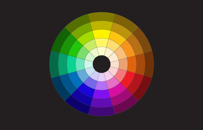
3.1 Primary, Secondary, and Tertiary Colors
Color theory forms the foundation of effective color usage in design. Primary colors (red, blue, yellow) are the building blocks from which secondary colors (orange, green, purple) emerge. Tertiary colors result from mixing a primary color with a neighboring secondary color, creating a nuanced and expansive color wheel.
3.2 Complementary and Analogous Color Schemes
Understanding color schemes is crucial in achieving visual harmony. Complementary colors, positioned opposite each other on the color wheel, create dynamic contrasts. Analogous colors, situated next to each other, offer a harmonious and cohesive visual experience. Designers strategically leverage these schemes to convey specific visual messages.
Section 4: Practical Applications of Color in Graphic Design
4.1 Branding and Identity
Color is a linchpin in establishing brand identity. Iconic brands such as Coca-Cola’s red or IBM’s blue use color to create instant recognition and convey brand values. Consistent color usage across various touchpoints fosters brand cohesion and reinforces brand recall.
4.2 Web and UI/UX Design
In the digital era, color plays a pivotal role in web and UI/UX design. Designers consider factors like readability, accessibility, and user experience when selecting color palettes. The psychology of color is harnessed to guide users, convey information hierarchy, and elicit specific actions.
4.3 Advertising and Marketing
Color is a strategic weapon in advertising and marketing, influencing consumer perceptions and behaviors. The selection of colors in advertisements can evoke desired emotions, establish a visual identity, and even influence purchasing decisions. Understanding the target audience is paramount in crafting effective color-centric marketing campaigns.
Section 5: Trends and Innovations in Color Usage
5.1 Minimalism and Monochromatic Palettes
Minimalist design trends often favor restrained color palettes, relying on a few carefully chosen hues to create impactful visuals. Monochromatic designs, utilizing variations of a single color, offer a sophisticated and cohesive aesthetic. These trends showcase the power of simplicity and strategic color restraint.
5.2 Gradient and Duotone Designs
Modern graphic design embraces dynamic and experimental color applications. Gradients, transitioning smoothly between two or more colors, add depth and dimension to designs. Duotone designs, utilizing two contrasting colors, create visually striking and contemporary visuals that resonate with contemporary audiences.
Section 6: The Technological Impact on Color
6.1 Digital Color Reproduction
Advancements in digital technology have revolutionized color reproduction. Designers now have access to an extensive spectrum of colors, allowing for precise calibration and consistency across various devices. Digital platforms offer designers the flexibility to experiment with color in ways previously unimaginable.
6.2 Color Matching and Calibration Tools
Color accuracy is paramount in design, and technology provides tools for precise color matching and calibration. Color management systems ensure consistency between digital and print materials, enabling designers to maintain fidelity to their intended color palettes across diverse mediums.
Section 7: Challenges and Considerations in Color Usage
7.1 Accessibility and Inclusivity
Ensuring color accessibility is a crucial consideration in design. Designers must be mindful of color contrast, legibility, and the potential impact on individuals with color vision deficiencies. Striving for inclusivity in design involves creating experiences that are accessible to diverse audiences.
7.2 Cultural Sensitivity
In a globalized world, designers must navigate the cultural implications of color choices. Colors that hold positive connotations in one culture may have different meanings in another. A nuanced understanding of cultural context is vital to avoid unintentional misinterpretations.
Section 8: Conclusion
In conclusion, color stands as an indispensable and multifaceted element in the expansive canvas of graphic design. From its historical roots to its contemporary applications, color has evolved into a dynamic tool for visual communication, emotional expression, and brand differentiation. As designers navigate the complexities of color theory, psychology, and application, they wield the transformative power of hues to create experiences that resonate, captivate, and leave an indelible mark on the visual landscape. In a world where visuals speak volumes, the mastery of color in graphic design continues to be a journey of exploration, innovation, and creative expression.