Suggestions for Typography That Will Help You Create Attention-Grabbing Graphics
Suggestions for Typography That Will Help You Create Attention-Grabbing Graphics
There is more to typography than just organizing letters on a page. This is a design element that has a great deal of strength since it is able to transmit mood, tone, and clarity. In the field of graphic design, the typeface you choose may be the deciding factor in determining whether your message connects with your audience or gets lost in the shuffle. Typefaces that are carefully selected improve readability, attract attention, and reinforce branding. On the other hand, even the most inventive designs might seem amateurish if they are accompanied with typography that is of poor quality. Designers who are looking to take their work to the next level should prioritize understanding typography as a crucial skill.
The Importance of Typography in Design
The art of typography is both utilitarian and aesthetically pleasing. It serves as a guide for the viewer’s eye, impacts emotions, and establishes the overall personality of a design. The use of typography that is powerful guarantees that the message will not only be noticed but also comprehended and retained in memory. Every single design decision that is linked to type, whether it be on posters or on websites, has an influence on the visual impact as well as the user experience.
When Selecting Fonts, Be Mindful of Their Intended Usage
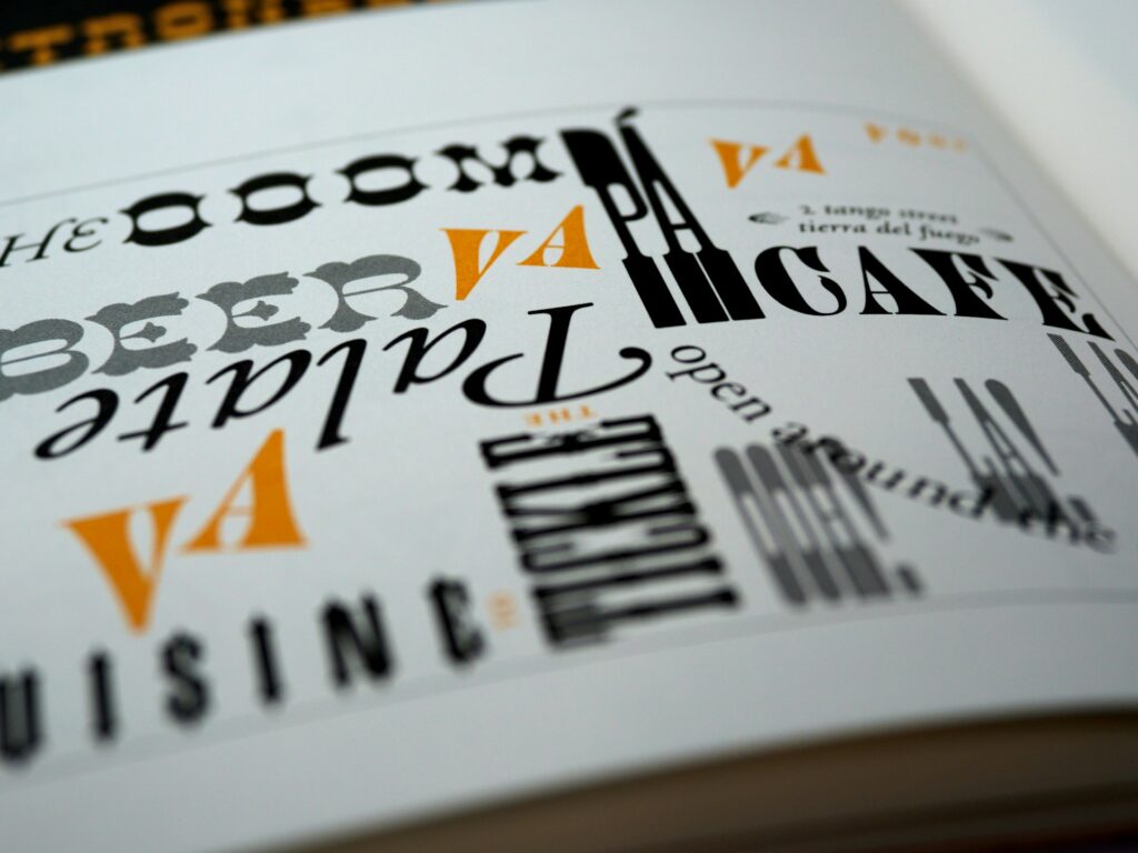
Each and every typeface has a unique personality. Serif typefaces are associated with professionalism and tradition, while sans-serif fonts have a more minimalist and contemporary vibe. While script typefaces may provide a sense of elegance, they also carry the danger of diminishing readability if they are employed excessively. It is essential that the font style used is appropriate for the tone of the project. To illustrate, a website for a law office benefits from authoritative serif fonts, yet a software company may flourish with sleek sans-serifs.
Make sure to keep the number of fonts that are used to a minimum.
Visual disorder is created when too many different typefaces are used. When it comes to designing, professionals often limit themselves to two or three fonts: a major font for headlines, a secondary font for body text, and sometimes an accent font for highlights. Maintaining consistency in design strengthens the brand’s identity and ensures that the design remains uncluttered.
Make Readability a Top Priority
The aim of a typeface is to make text easier to read, therefore regardless of how fashionable a font seems, it is ultimately unsuccessful if it is difficult to read. It is essential that text remains readable regardless of the device or size of the screen. When it comes to body text, it is best to avoid using fonts that are highly beautiful. Instead, save such types of fonts for headlines or brief phrases, where the impact of the words is more important than their legibility.
Utilize a hierarchy to lead the viewer’s gaze.
The viewer is able to identify the place where they should begin their search because to the presence of hierarchy. Headings should be in bold or higher font sizes, subheadings should be somewhat smaller, and body content should be in the most neutral font size. When the size, weight, and spacing are adjusted, a clear route for the eye is created, which makes the design simpler to traverse.
Pay attention to the amount of space that is available.
The selection of typefaces is not the sole aspect of typography; it also encompasses the ways in which letters and lines communicate with one another. Readability and aesthetics are both influenced by kerning, which is the amount of space between letters, leading, which is the amount of space between lines, and tracking, which is the overall spacing of the text. Ensuring that there is appropriate space between elements avoids designs from seeming disorganized or incomplete.
Impact Is Generated Through Contrast
The use of contrasting typefaces, widths, or weights may be an effective way to draw attention to important information and add visual interest to a piece. When you combine a striking typeface for the headline with a font that is basic for the body of the text, you generate focus and balance. On the other hand, contrast should be used with purpose; if there is too much variance, it may disorient rather than captivate the audience.
Make sure that the text is aligned in a thoughtful manner.
Alignment is an essential factor to consider while creating the architecture of a design. When it comes to readability, left alignment is the most natural option; nonetheless, center alignment is effective when used for brief headlines or invites. Although right alignment may be useful in contemporary design, it should be applied with caution in order to prevent uncomfortable space.
Take White Space Into Consideration
White space, or negative space, provides typography with the opportunity to breathe and thrive. Text that is too crowded makes the material seem intimidating and unappealing. When white space is used strategically, it increases readability and gives designs a clean, professional appearance.
Make adjustments to the typography for various platforms
Typography that is effective in print may not be effective in digital formats. When designing, designers must to take into account screen resolutions, adaptable layouts, and accessibility. For example, when it comes to web typography, fonts that are sans-serif and appear clearly across a variety of devices are advantageous.
Avoid Making Common Mistakes
It is common for people who are new to typography to make mistakes like overusing stretched fonts, combining too many different types, or depending on styles that are out of date. Ignoring alignment grids is an additional problem that may lead to layouts that are inconsistent. The distinction between professional design and amateur efforts is on maintaining typography that is clear, consistent, and deliberate.
Test and Iterate
Experimentation is necessary in order to get great typography. The end output is both useful and aesthetically pleasing when a variety of font pairings are tried, the spacing is adjusted, and designs are previewed across a range of devices. Designers may get useful input that can be used to improve their decisions by testing their typeface with actual users or customers.
The Use of Typography as a Component of Branding
Typography is a tool that is used for branding, and it goes beyond just being a matter of design preference. When fonts are consistently used across all marketing materials, brand recognition and trust are developed. In the same way that a brand may be immediately recognized by its logo or color scheme, it can also become quickly identifiable by having a strong typographic identity.
Typography is a fundamental aspect of graphic design. It brings together communication and art in order to ensure that images not only seem aesthetically pleasing but also convey the message that was intended. Designers have the capacity to produce visuals that are appealing to the eye and that stand out from the crowd by carefully selecting typefaces, keeping consistency, and adhering to the principles of readability, hierarchy, and contrast. When it comes to mastering typography, it is not so much about remembering rules as it is about exercising balance. This means that you need to know when to keep things simple and when to make bold decisions.