Unveiling the Art of Color Matching: A Comprehensive Guide to Matching Colors of Objects Between Photos with Photoshop
Introduction:
In the realm of digital design and photo manipulation, achieving seamless color harmony across different images is a skill that can elevate the visual impact of your creations. Adobe Photoshop, a powerhouse in the world of graphic design, provides an array of tools and techniques for matching colors between photos. This comprehensive guide will unravel the intricacies of color matching using Photoshop, offering step-by-step instructions, tips, and insights into the art of achieving cohesive color schemes across diverse images.
Section 1: Understanding Color Spaces and Consistency
1.1 RGB vs. CMYK: Before delving into color matching, it’s essential to understand the distinction between RGB (Red, Green, Blue) and CMYK (Cyan, Magenta, Yellow, Black) color spaces. Recognizing the appropriate color mode for your project ensures consistency in color representation across different media.
1.2 Consistency in Lighting Conditions: Achieving accurate color matching requires consistent lighting conditions in the source images. Differences in lighting can significantly impact color perception, making it crucial to select or adjust images under similar lighting environments.
Section 2: Leveraging Photoshop’s Color Matching Tools
2.1 Eyedropper Tool: The Eyedropper tool in Photoshop serves as a fundamental instrument for color matching. Learn how to use this tool to sample colors from one image and apply them to another, ensuring precision in color reproduction.
2.2 Color Sampler Tool: Dive into the advanced capabilities of the Color Sampler tool. Explore how to set sample points on different images and compare color values, facilitating a meticulous approach to color matching.
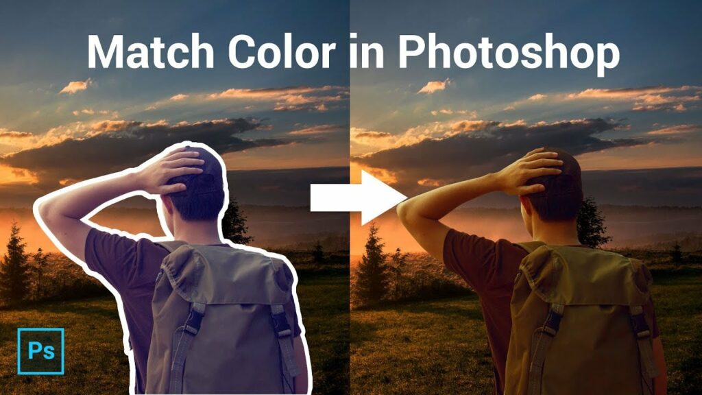
2.3 Match Color Command: Photoshop’s Match Color command is a powerful feature that automates the color matching process. Uncover the nuances of this tool, which allows you to harmonize colors between photos by specifying a reference image and a target image.
Section 3: Mastering Adjustment Layers for Color Matching
3.1 Hue/Saturation Adjustment Layer: Harness the potential of the Hue/Saturation Adjustment Layer to fine-tune the color tones in your images. Discover how selective adjustments can bring cohesiveness to the color palette across different photos.
3.2 Color Balance Adjustment Layer: Delve into the intricacies of the Color Balance Adjustment Layer. Learn how to manipulate the balance of shadows, midtones, and highlights to achieve a unified color scheme, even when merging elements from disparate sources.
3.3 Selective Color Adjustment Layer: Uncover the Selective Color Adjustment Layer and its ability to target specific color ranges. Master the art of refining individual color channels to match the hues and saturations between photos seamlessly.
Section 4: Custom Techniques for Precise Color Matching
4.1 Manual Color Sampling and Application: For ultimate control, explore the manual approach of color sampling and application. Understand how to manually select colors, create a swatch palette, and meticulously paint or fill areas to achieve precise color matching.
4.2 Color Matching with Gradient Maps: Unlock the creative potential of Gradient Maps for color matching. Learn how to use gradient maps to map specific colors to tonal values, creating a dynamic and visually appealing color transformation across images.
Section 5: Tips for Achieving Realistic and Consistent Results
5.1 Consider Ambient Light Conditions: Always consider the ambient light conditions in both source and target images. Adjustments may be required to simulate consistent lighting, preventing color discrepancies.
5.2 Use High-Quality Source Images: Start with high-quality source images to ensure accurate color representation. Low-resolution images may introduce artifacts and limit the effectiveness of color matching.
5.3 Fine-Tune with Layer Opacity: Utilize the Layer Opacity setting to fine-tune the intensity of color adjustments. Adjusting opacity allows for subtle blending and can contribute to a more realistic and natural color match.
Conclusion:
In the dynamic world of digital design, mastering the art of color matching between photos with Photoshop opens up a realm of creative possibilities. This comprehensive guide has provided you with the tools, techniques, and insights needed to achieve seamless and harmonious color schemes across diverse images. As you embark on your color-matching journey, experiment, refine, and let your creative vision flourish, ensuring that your designs resonate with vibrant and cohesive color palettes across every project.