Creating Data Visualizations and Graphs in LabVIEW
Introduction
Data visualization is a powerful technique for presenting data in a graphical or visual format to facilitate understanding, analysis, and decision-making. LabVIEW (Laboratory Virtual Instrument Engineering Workbench), developed by National Instruments, offers robust capabilities for creating interactive and informative data visualizations and graphs. This comprehensive guide explores the fundamentals, techniques, and practical applications of creating data visualizations in LabVIEW, covering various types of graphs and visualization tools available.
Understanding Data Visualization
What is Data Visualization?
Data visualization involves representing data and information visually, often in the form of charts, graphs, maps, or other graphical formats. Key objectives of data visualization include:
- Insight Generation: Visualizing data to discover patterns, trends, and relationships.
- Communication: Presenting complex data in a clear and understandable manner.
- Decision-Making: Using visualizations to support informed decision-making processes.
Importance of Data Visualization
- Enhanced Understanding: Visual representations make data easier to interpret and analyze.
- Effective Communication: Visuals help convey insights and findings more effectively than raw data.
- Identifying Trends: Visualizations facilitate the identification of patterns and trends that may not be apparent in tabular data.
Types of Data Visualizations
- Charts: Line charts, bar charts, pie charts, scatter plots.
- Graphs: XY graphs, waveform graphs, histogram plots.
- Maps: Geographic maps and spatial data representations.
- Dashboards: Integrated displays of multiple visualizations for comprehensive data analysis.
LabVIEW for Data Visualization
Overview of LabVIEW
LabVIEW provides a graphical programming environment tailored for data acquisition, analysis, and visualization:
- Graphical Programming: Develop visualizations using a drag-and-drop interface with graphical dataflow diagrams.
- Extensive Libraries: Access built-in libraries of graph and chart components for rapid application development.
- Real-Time Capabilities: Create real-time data visualizations for monitoring and control applications.
- Integration with Hardware: Interface seamlessly with DAQ devices, instruments, and external sensors.
Key Components for Data Visualization in LabVIEW
- Front Panel: User interface where visual elements such as graphs and charts are displayed and interacted with.
Example: Temperature Monitoring Dashboard
- Graphs: Display real-time temperature data using waveform graphs.
- Charts: Show temperature trends over time using trend charts.
- Indicators: Present current temperature readings using numeric indicators.
- Block Diagram: Graphical representation where data processing algorithms and logic for visualization are implemented.
Example: Data Acquisition and Visualization Workflow
- Data Acquisition: Read temperature data from sensors connected to DAQ hardware.
- Data Processing: Filter, analyze, and format data for display.
- Visualization Update: Update graphs and charts with the latest data.
Creating Data Visualizations in LabVIEW
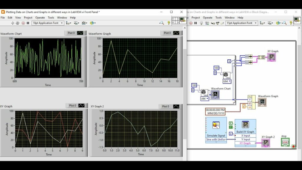
Step-by-Step Guide to Creating Graphs
- Choose Graph Type: Select the appropriate graph or chart type based on the data and visualization requirements.
- Line Graph: Visualize trends and changes over time.
- Bar Chart: Compare quantities or categories.
- Scatter Plot: Display relationships between variables.
- Place Graph Components: Drag and drop graph components onto the front panel.
Example: Adding a Line Graph
- Drag Graph Icon: Place an XY Graph from the Controls palette onto the front panel.
- Configure Graph Properties: Set graph properties such as axis scaling, labels, and colors.
- Data Binding: Bind data sources (e.g., arrays, variables) to the graph components.
Example: Binding Temperature Data
- Wire Data Source: Connect temperature data acquired from DAQ hardware to the graph.
- Update Data: Continuously update graph with new data points as they are acquired.
- Customize Appearance: Customize the appearance of graphs and charts to enhance clarity and visual appeal.
- Axis Scaling: Adjust axis ranges and scales to fit the data range.
- Markers and Legends: Add markers, legends, and annotations to highlight key points or data series.
Example: Real-Time Data Visualization
- Acquire Real-Time Data: Use LabVIEW and DAQ hardware to acquire continuous data streams (e.g., temperature, pressure).
- Continuous Measurement: Read data from sensors at regular intervals.
- Buffer Management: Manage data buffers to handle high-frequency data updates.
- Display Real-Time Graphs: Update graphs and charts in real-time to visualize streaming data.
- Waveform Graphs: Display time-series data with scrolling or sliding window updates.
- Streaming Updates: Update graphs dynamically as new data arrives.
- Interactive Controls: Implement interactive controls to manipulate and filter data displayed on graphs.
- Slider Controls: Adjust time window or data range displayed on graphs.
- Zoom and Pan: Enable users to zoom in or pan across data for detailed analysis.
Advanced Data Visualization Techniques
- Custom Graphical Controls: Create custom graphical controls and indicators using LabVIEW’s graphical design tools.
- Custom Plotting: Implement specialized plotting and visualization techniques.
- User-Defined Graphics: Design unique visual elements tailored to specific application needs.
- 3D Visualization: Develop three-dimensional visualizations and plots using LabVIEW’s 3D graphing capabilities.
- Surface Plots: Visualize data on 3D surfaces to analyze spatial relationships.
- Volume Visualization: Display volumetric data for scientific and medical imaging applications.
Practical Applications of Data Visualization in LabVIEW
Engineering and Manufacturing
- Quality Control: Monitor production metrics and process variables using real-time dashboards and trend charts.
- Process Optimization: Analyze performance data to identify inefficiencies and optimize manufacturing processes.
Scientific Research
- Experimental Data Analysis: Visualize experimental data (e.g., particle trajectories, spectroscopic data) for analysis and interpretation.
- Simulation Results: Display simulation outputs using graphs and charts to validate models and hypotheses.
Education and Training
- Interactive Learning: Create virtual labs and educational modules with interactive graphs and simulations.
- Student Projects: Support student research and projects by visualizing data acquired from experiments.
Challenges and Considerations
Performance Optimization
- Efficient Data Handling: Optimize data acquisition and processing algorithms for speed and responsiveness.
- Real-Time Updates: Ensure smooth and responsive updates for real-time data visualizations.
Data Accuracy and Integrity
- Data Validation: Implement data validation and error-checking mechanisms to ensure accurate visual representations.
- Data Filtering: Apply filters and smoothing techniques to improve data quality and visualization clarity.
User Interface Design
- Usability: Design intuitive and user-friendly interfaces for effective data exploration and analysis.
- Accessibility: Ensure accessibility of visualizations for users with diverse needs and preferences.
Conclusion
Creating data visualizations and graphs in LabVIEW empowers users to transform complex data into clear, actionable insights across various fields and applications. LabVIEW’s graphical programming environment, coupled with its extensive libraries and real-time capabilities, provides a versatile platform for developing interactive and informative visualizations. By leveraging LabVIEW’s tools for graph creation, customization, and real-time data handling, engineers, scientists, and educators can effectively analyze data, communicate findings, and make informed decisions. Whether in research laboratories, industrial settings, or educational institutions, LabVIEW continues to play a pivotal role in advancing data visualization and analysis practices, driving innovation and discovery in diverse domains of engineering and science.